


The Situation
A business that had outgrown its brand.
Mendip Handyman had been quietly evolving for years. What started as local handyman work — the odd jobs, the small repairs — had grown into something else entirely: full property renovations. Kitchen transformations. Room extensions. Complete whole-house refits. Serious craft, delivered to a high standard, with a growing reputation to match.
The problem was simple: nobody could tell from the outside.
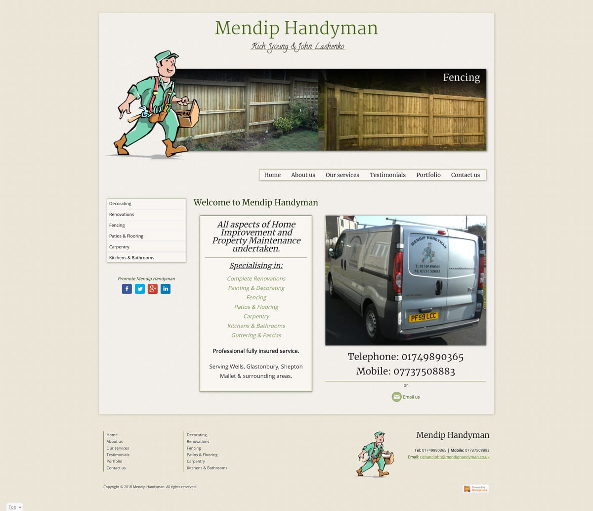
The website still led with clip-art imagery. The logo hadn’t changed. Every time a prospective client landed on the site, they encountered a brand that didn’t reflect the quality of the work behind it. That gap between reality and first impression was costing them business they’d never know they lost.
The Brief
Evolve it — don’t erase it.
The instinct might have been a clean break. But that would have been the wrong call.
Mendip Handyman had spent years earning genuine local trust. People knew the name. They’d recommended it to neighbours, family, friends. That reputation had real value — and protecting it was part of the brief.
The challenge: make it look like the business it had actually become. Premium, but still warm. Confident, but still local. A brand that earns the work they were already doing — and attracts more of it.
What We Built
Strategy. Identity. A site that converts.
Brand strategy
Before any design, we needed clarity on what Mendip Handyman had actually become. That meant articulating the shift: from general trades to specialist renovation. From "can you fix my fence?" to "can you transform my kitchen?" That foundation shaped every decision that followed — tone, visual language, photography direction, the words on the page.
Logo & identity
The clip-art illustration was retired. In its place: a clean typographic wordmark — crafted to communicate quality and scale cleanly from a van door to a website header, without losing the warmth that made the original brand trusted.
Recognisably Mendip Handyman. Unmistakably elevated.
Website design & build
The new site had one job: let the quality of the work speak, and make it easy to get in touch.
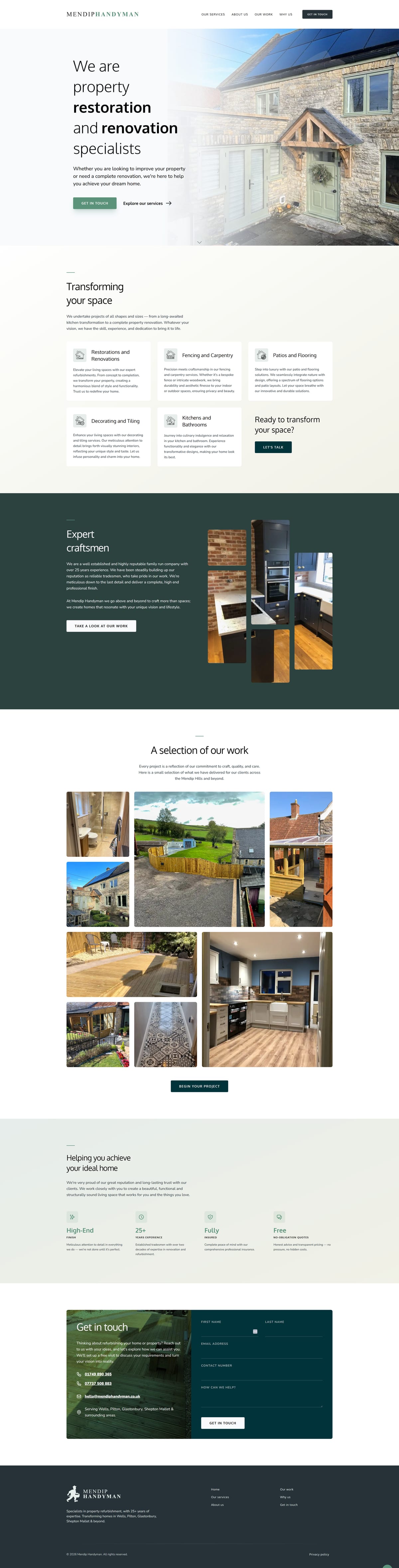
Photography-first layout. Clear hierarchy. A straightforward enquiry flow. Designed and built as one continuous piece of work — no handoffs, no gap between design intent and delivered product.
Before: a cluttered layout with dated styling, renovation photography buried under heavy design, and a brand that actively undersold the business.
After: a fast, image-led site that positions Mendip Handyman exactly where they belong — as the specialist you call when the job actually matters.
The Result
Built in two weeks, from brief to live. A brand and a website that finally match the quality of the work — and give the business the platform to attract clients at the level they deserve.
"We knew the brand didn’t reflect the work anymore. Sam got it immediately — pushed back in the right places and came back with something we’re genuinely proud to send clients to. The quality of enquiries since has been noticeably different." — Owner, Mendip Handyman